A Triumph of Non-Cooperation
What strikes one first about this gathering is its total lack of synergy. It’s not so much a "composition" as it is a visual representation of seven very polite, but entirely different, ideas all happening simultaneously. It is, to put it mildly, masterfully irrelevant.
Notable Features:
The Shapes (AS INDIVIDUALS): We have a purple spritzer. A pale-blue sort-of-person waving. A dark-blue glob that looks like it’s about to merge with the red spritzer. A yellow smudge. A large teal blob that looks like a tired dragon. And a small, pale-orange star. One appreciates the effort in creating shapes that so pointedly ignore each other.
The Interplay (AS GHOSTS): There is absolutely no relationship between these forms. No overlap, no touching, barely even a consistent spacing. They seem less like a "family of forms" and more like commuters who are strictly avoiding eye contact. It is a masterclass in polite distance.
The Palette: It’s a riot of colour—yellow, purple, teals, oranges, blues, red—but like a buffet that has run out of plates, nothing quite combines. It's enthusiastic, yes, but also utterly uncoordinated.
Why it’s "Quite Nice":
This piece is ideal for a wall that you want to fill, but without actually saying anything. It avoids any of that dreadful obviousness. It is the perfect visual companion for a room that wants to say "we are vibrant," while actually wishing everyone would just be quiet.
"It’s... certainly got a lot of things. In it." — A cousin from Cheltenham, trying to frame a compliment.


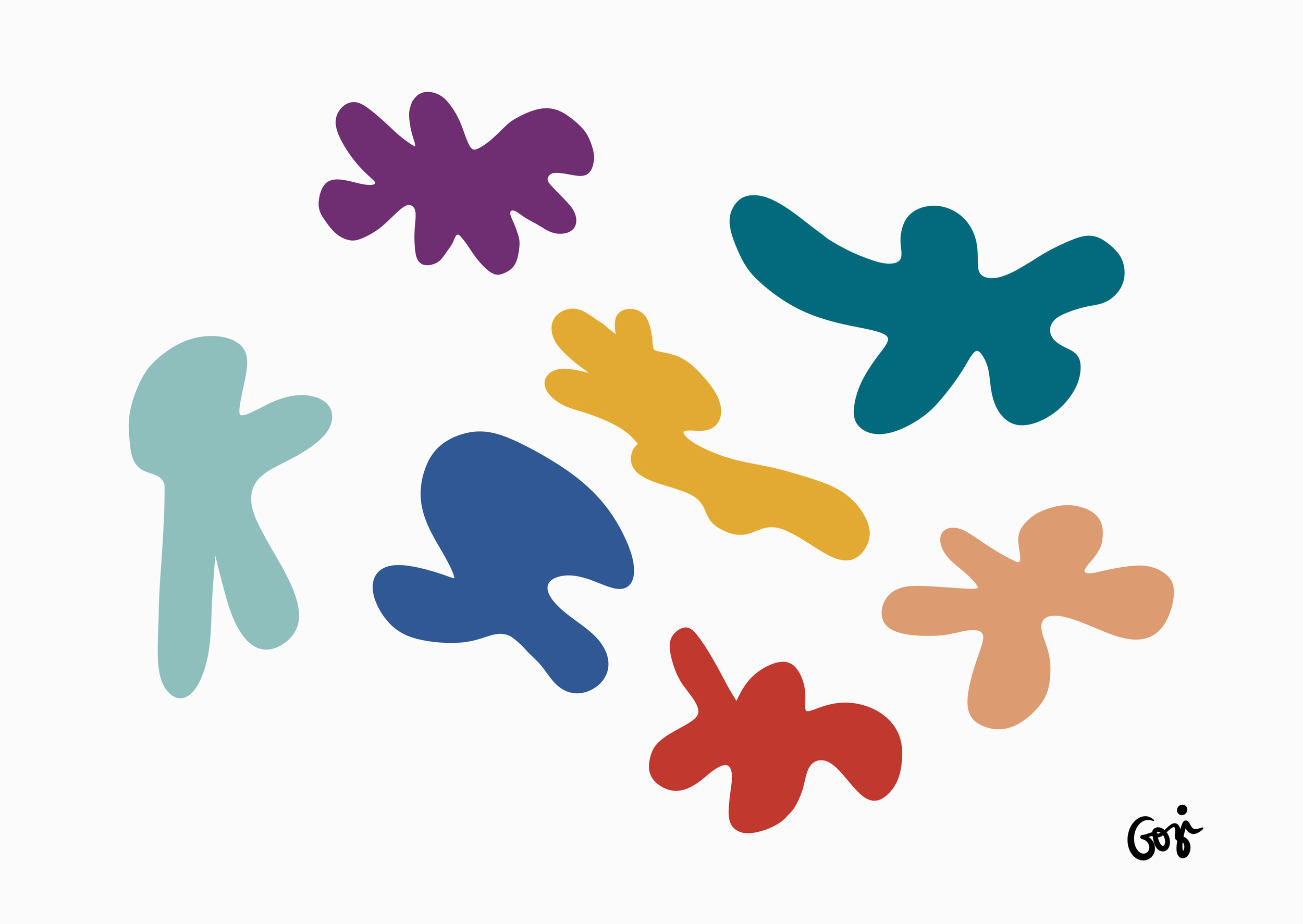 Image 1 of 6
 Image 2 of 6
 Image 3 of 6
 Image 4 of 6
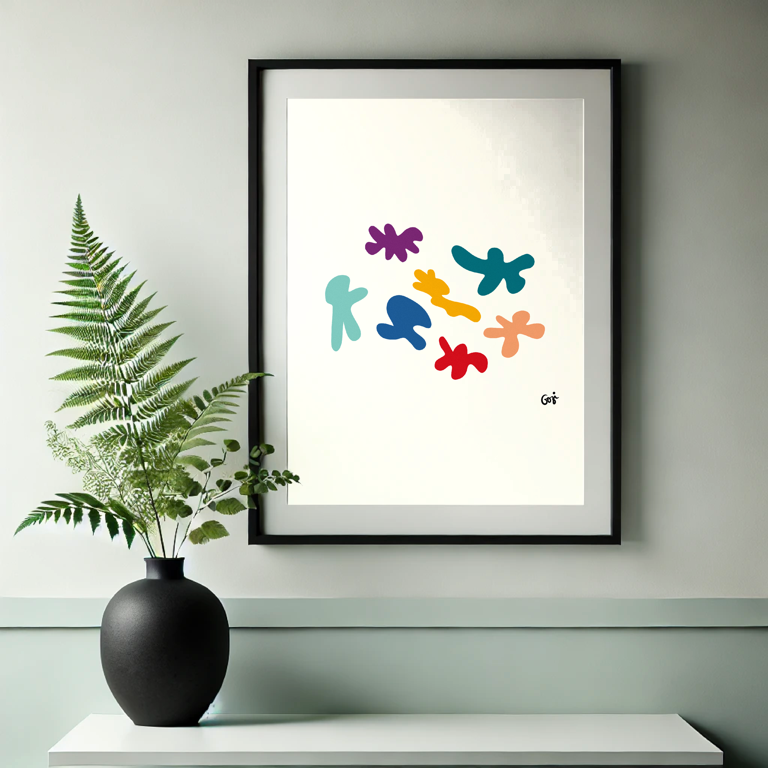 Image 5 of 6
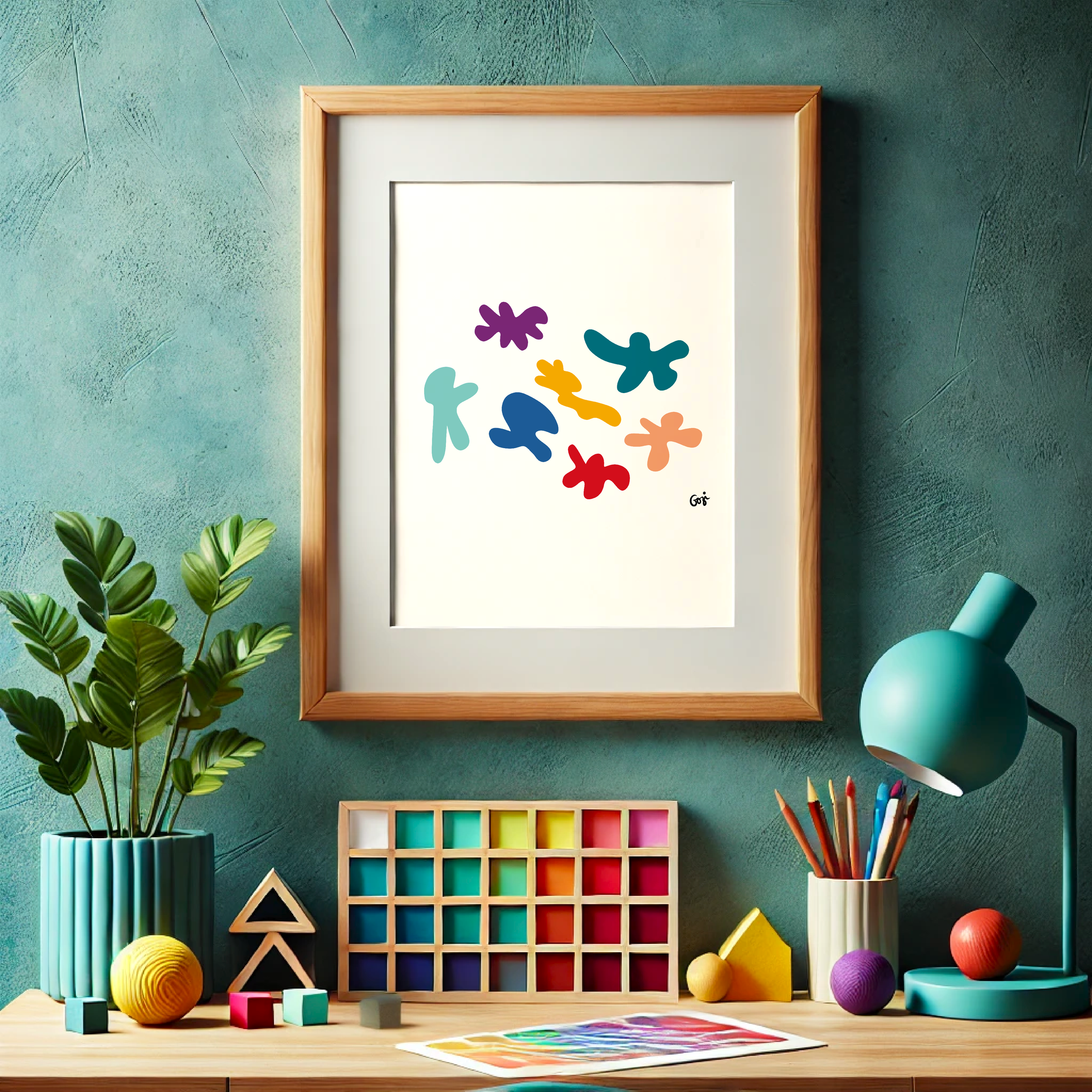 Image 6 of 6