

 Image 1 of 4
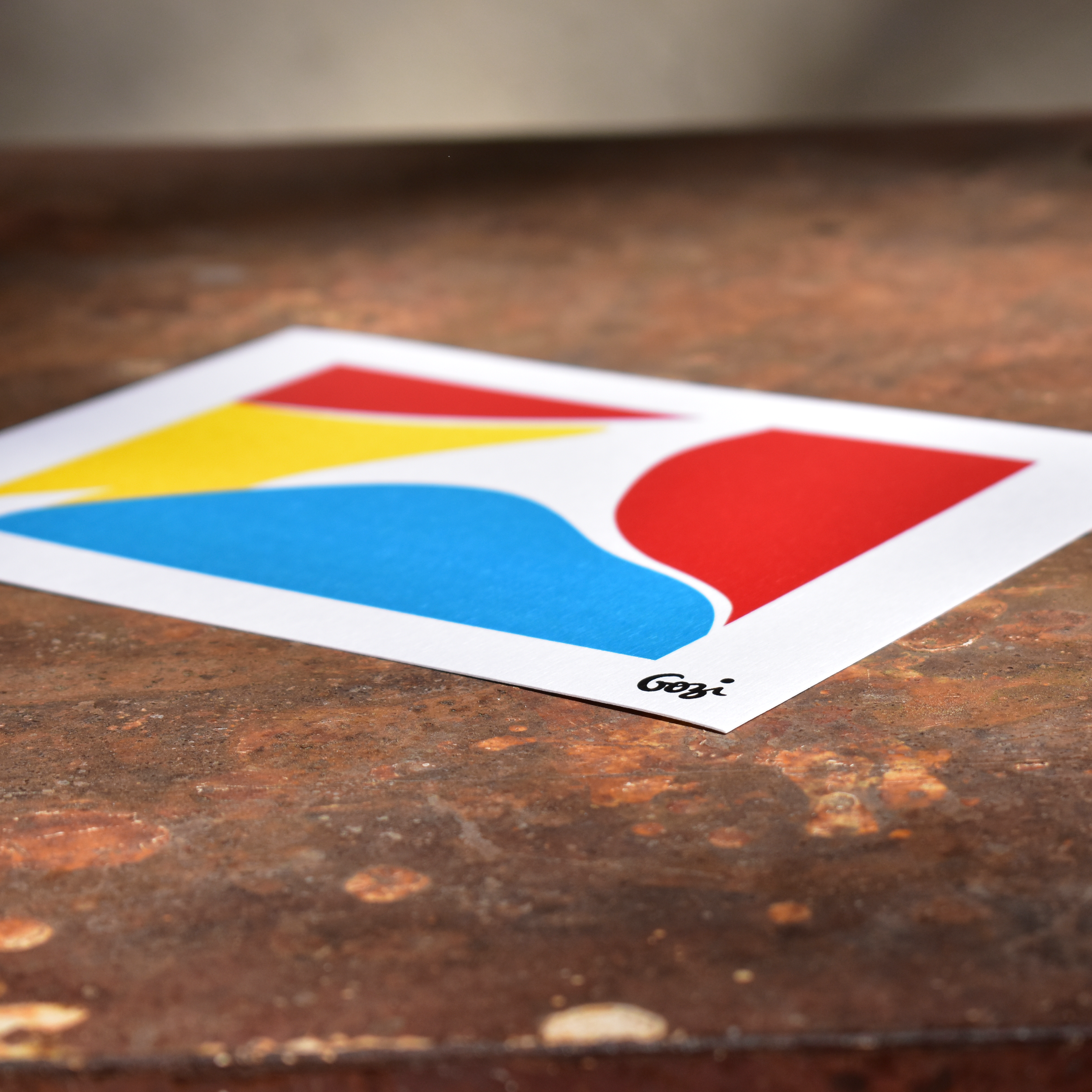 Image 2 of 4
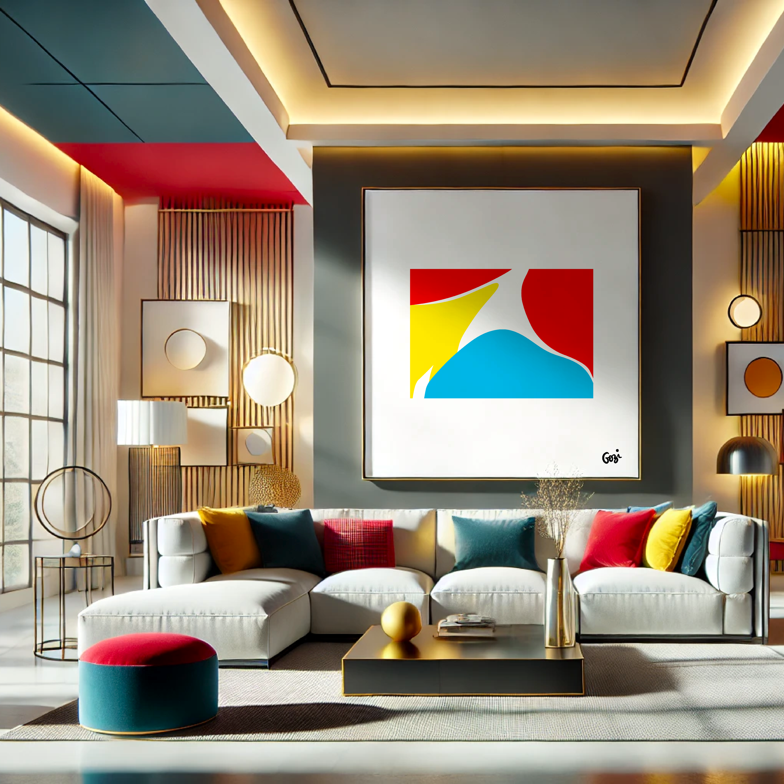 Image 3 of 4
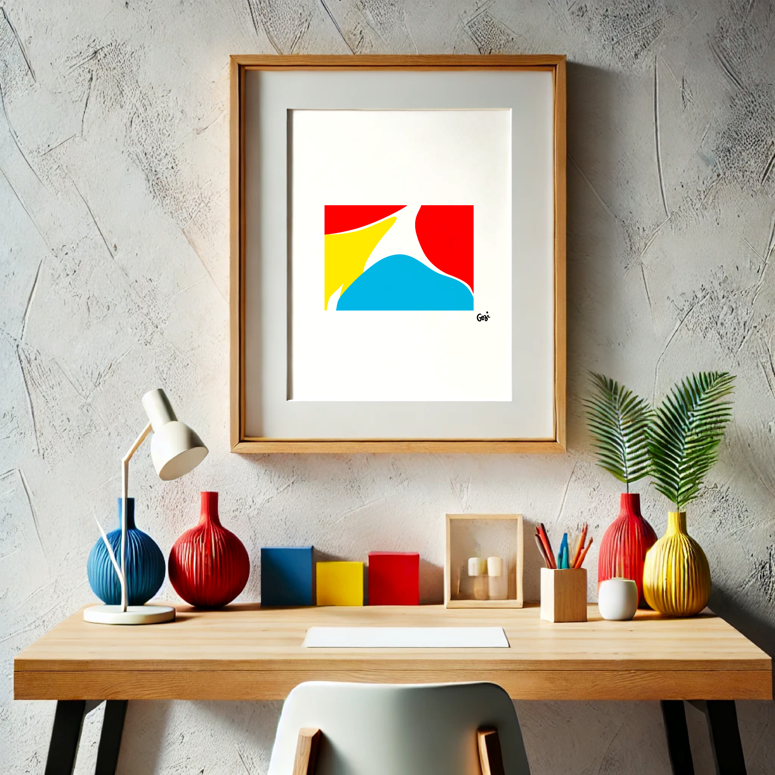 Image 4 of 4
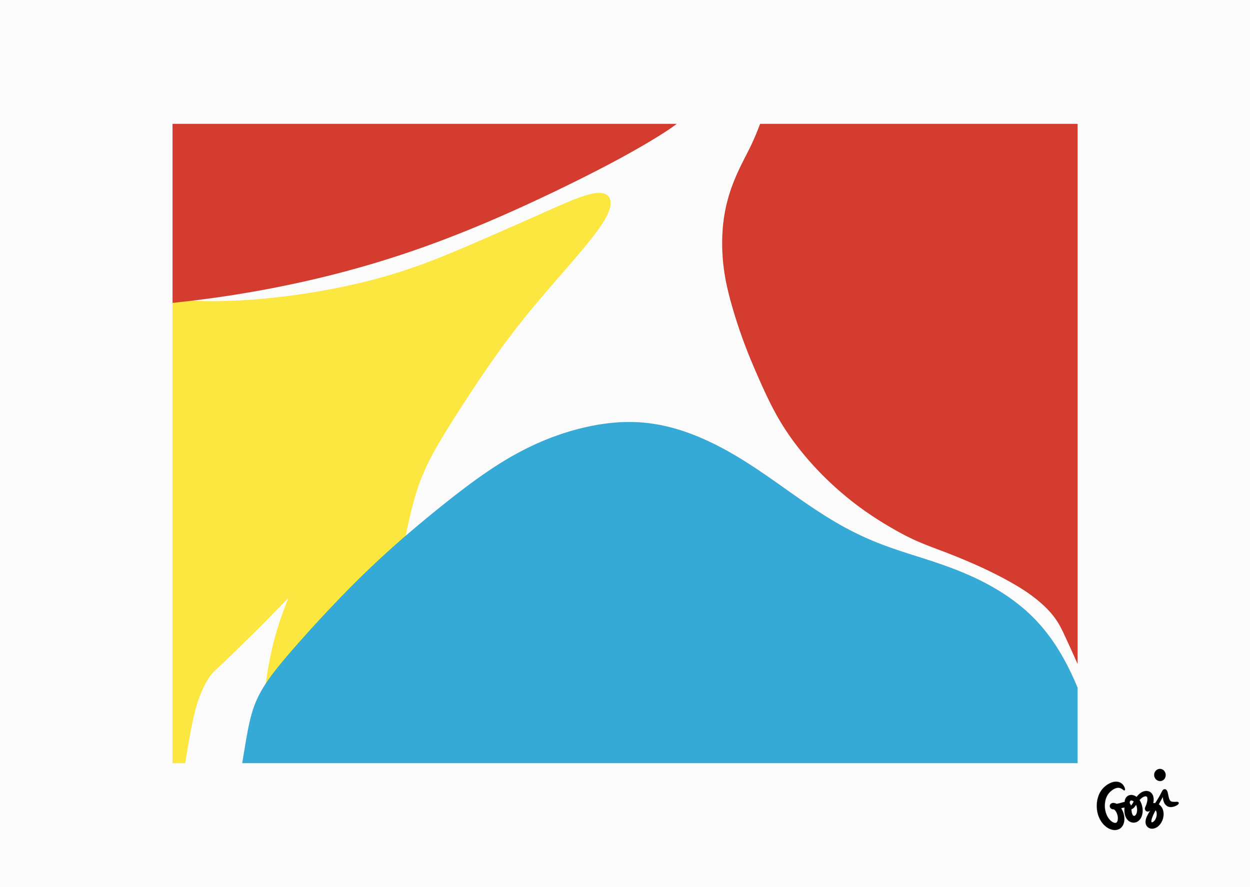
Welcome to our latest curatorial offering from the elusive Gozi—a print that asks, with a distinctly British quietness, "Must we actually depict anything?" This piece is a masterclass in understatement, assuming you can understate with three exceptionally bright primary colours.
This work features four key elements, arranged in a manner that can only be described as deliberate.
The Unavoidable Red (x2): We present two distinct areas of red. One is a decisive rectangle occupying the top left. The other is a sweeping, organic curve on the right, which seems to be having a mild disagreement with the rectangle's hard edge.
The Jaunty Yellow (x1): Nested below the red rectangle is a delightful yellow abstract. It starts with a point and then... well, it just expands. It's yellow. There's not much more one can say about it, really.
The Contrasting Cyan (x1): The base is anchored by a large, cyan shape. It's blue. Distinctly blue. It suggests a foundation, or perhaps just a desire to use the third primary colour.
"A definitive statement for the modern dwelling that finds narrative in art to be utterly exhausting. It’s an understated statement, specifically designed for those who wish to declare their 'thoughtful' appreciation for the irregular without actually committing to a definitive shape. Or perhaps they just ran out of options."
Artist: Gozi (the signature is right there, for accountability).
Medium: Fine print. (Because "some paint we found" doesn't sound quite as refined.)
Orientation: Horizontal. For maximum colour field distribution.
Palette: The Holy Trinity: Red, Yellow, Cyan. The binary options of life, captured in block form.
Framing Suggestions: A simple black frame will provide a strict boundary for the shapes. A simple white frame will make them feel slightly trapped. Natural wood will make them feel self-conscious about their industrial perfection.
Pairs wonderfully with a lukewarm cup of tea, and a mild, unexpressed confusion.