

 Image 1 of 5
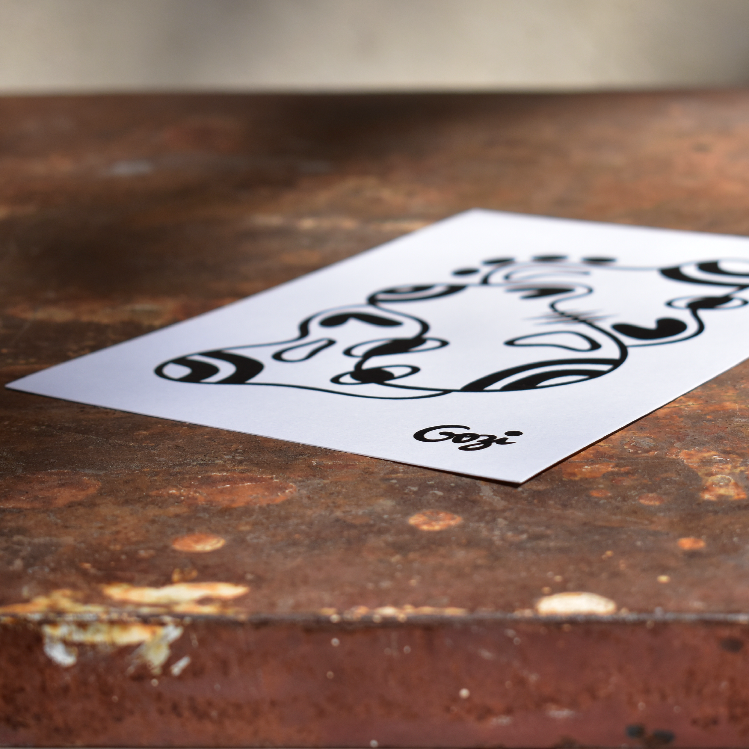 Image 2 of 5
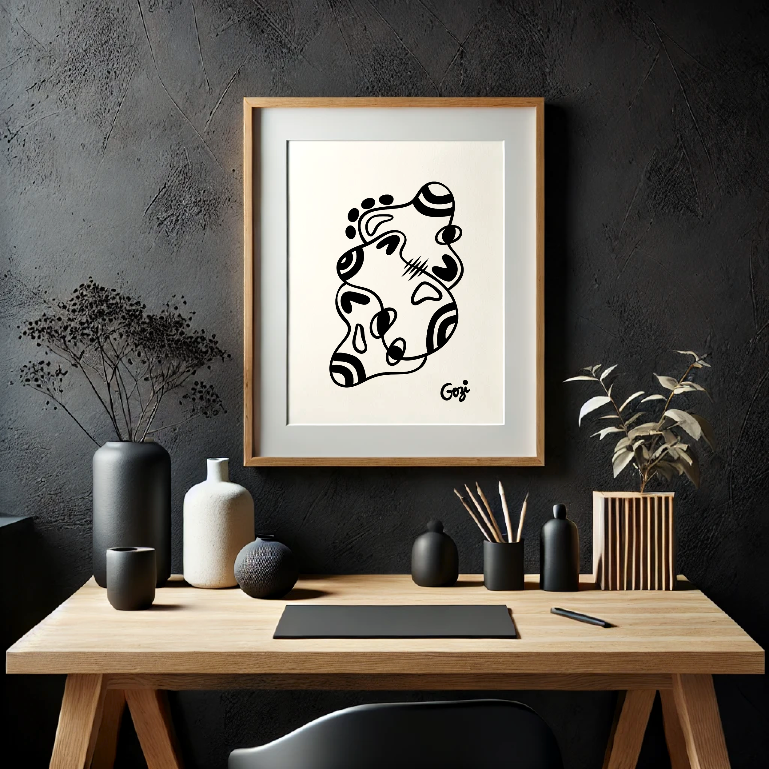 Image 3 of 5
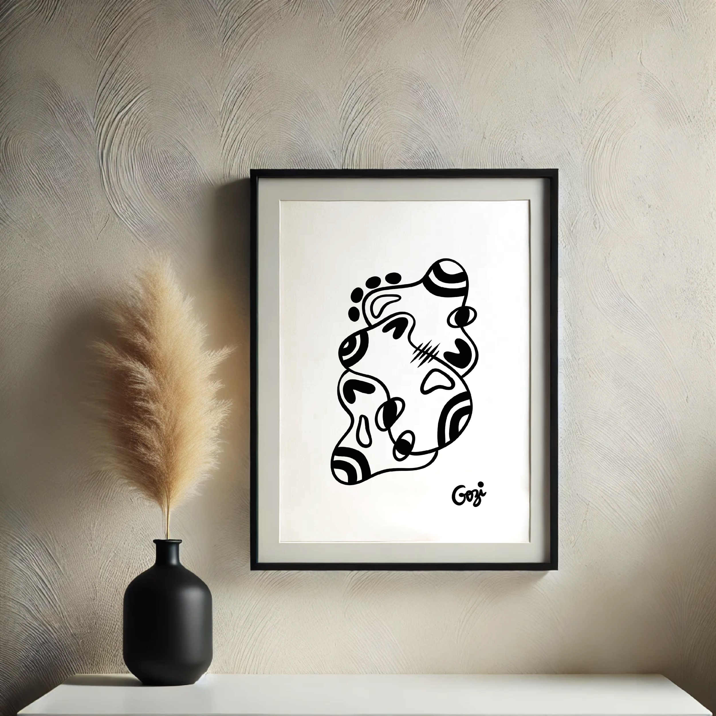 Image 4 of 5
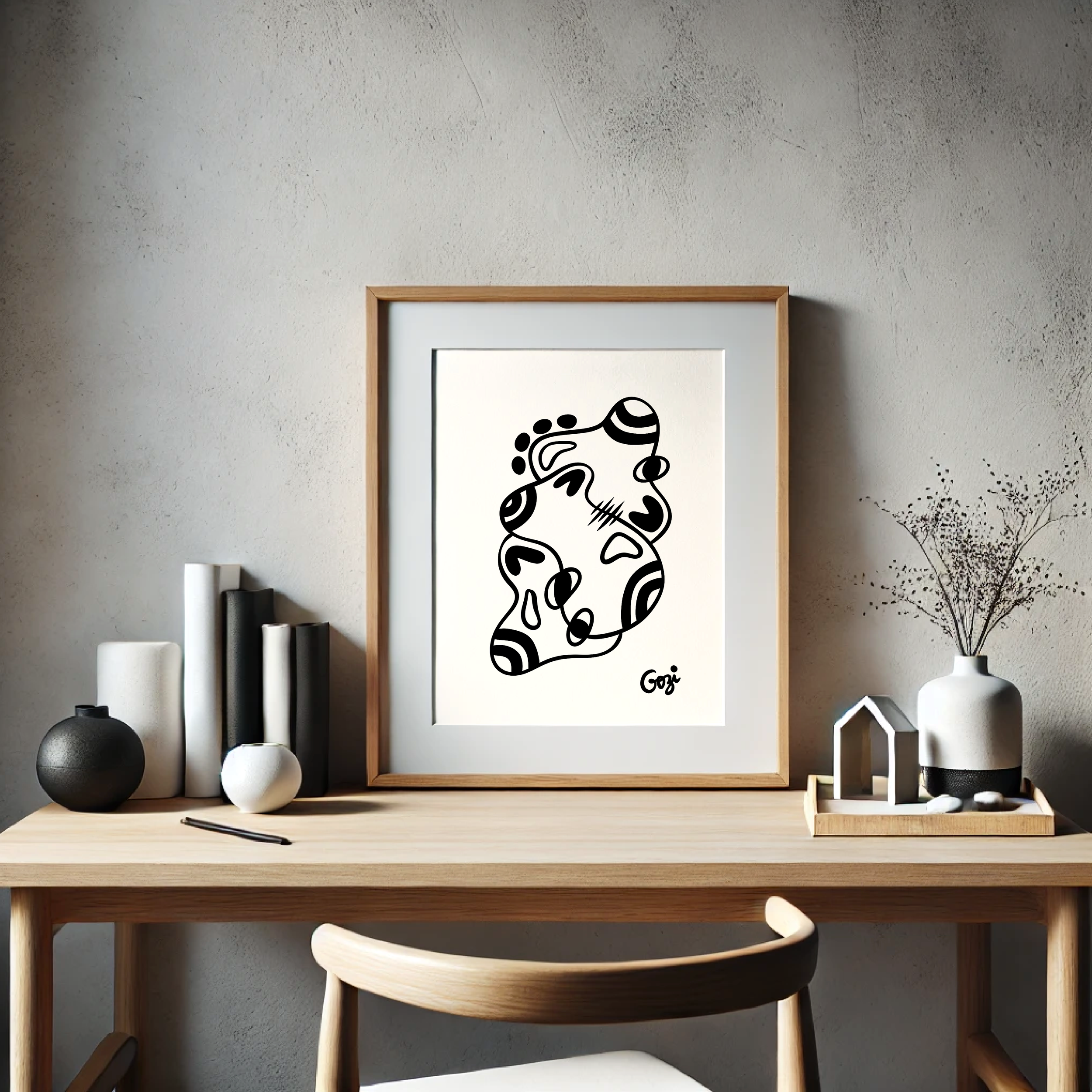 Image 5 of 5
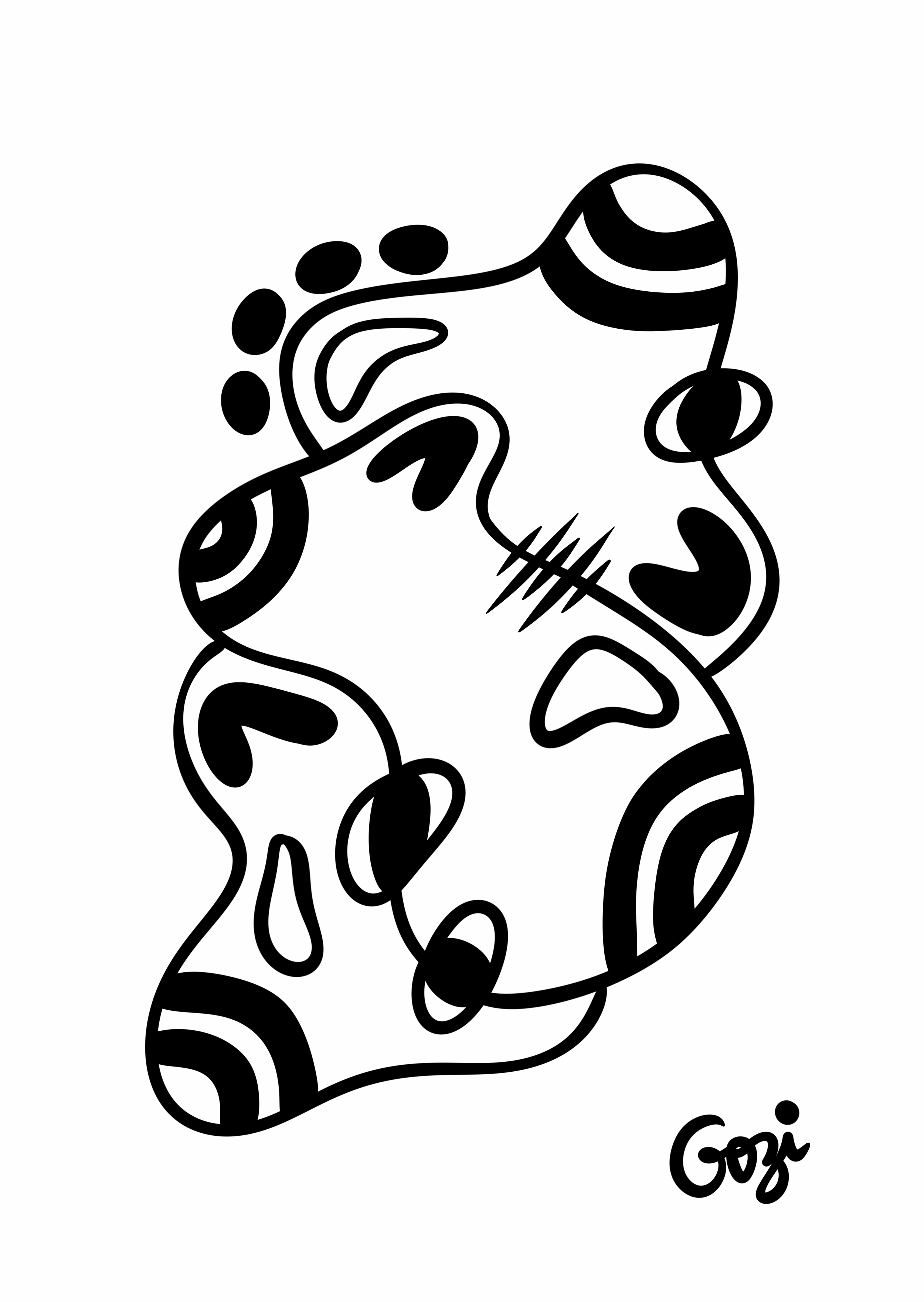
While the previous pieces were merely confused, this one feels like it’s actively trying to remember where it left its keys. It’s a work that has looked at the concept of "composition" and decided it’s far too much paperwork. It is, to be perfectly blunt, rather a lot of effort for very little result.
The Silhouette: It’s less of a "shape" and more of a "geographical incident." It has the silhouette of a spilled ink pot that’s trying to maintain some dignity.
The "Eye" Situation: There’s a distinct feeling of being watched by several mismatched pupils. It’s not quite "Big Brother," it’s more like "Disapproving Neighbour Peeking Through the Curtains."
The Central Scritch: That little cluster of lines in the middle—the visual equivalent of someone losing their temper for exactly three seconds and then immediately apologising. It’s the only part of the piece that seems to have any pulse.
The Patterning: We have stripes, we have solids, we have voids. It’s a buffet of textures where nothing quite pairs with anything else. It’s like a wardrobe malfunction in a very expensive boutique.
This is the perfect piece for someone who wants to fill a space with "Visual Noise" without the commitment of an actual melody. It’s the art version of a white noise machine, but set to "anxious."
"It’s... certainly got a personality. Whether you'd want to live with it is another matter." — An auntie from Surrey, after three gins.