

 Image 1 of 5
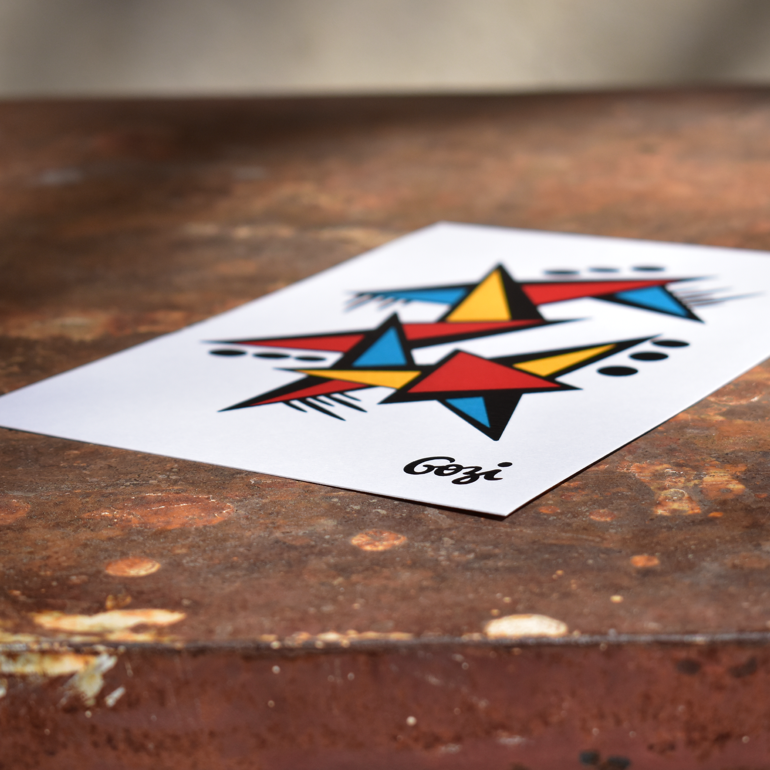 Image 2 of 5
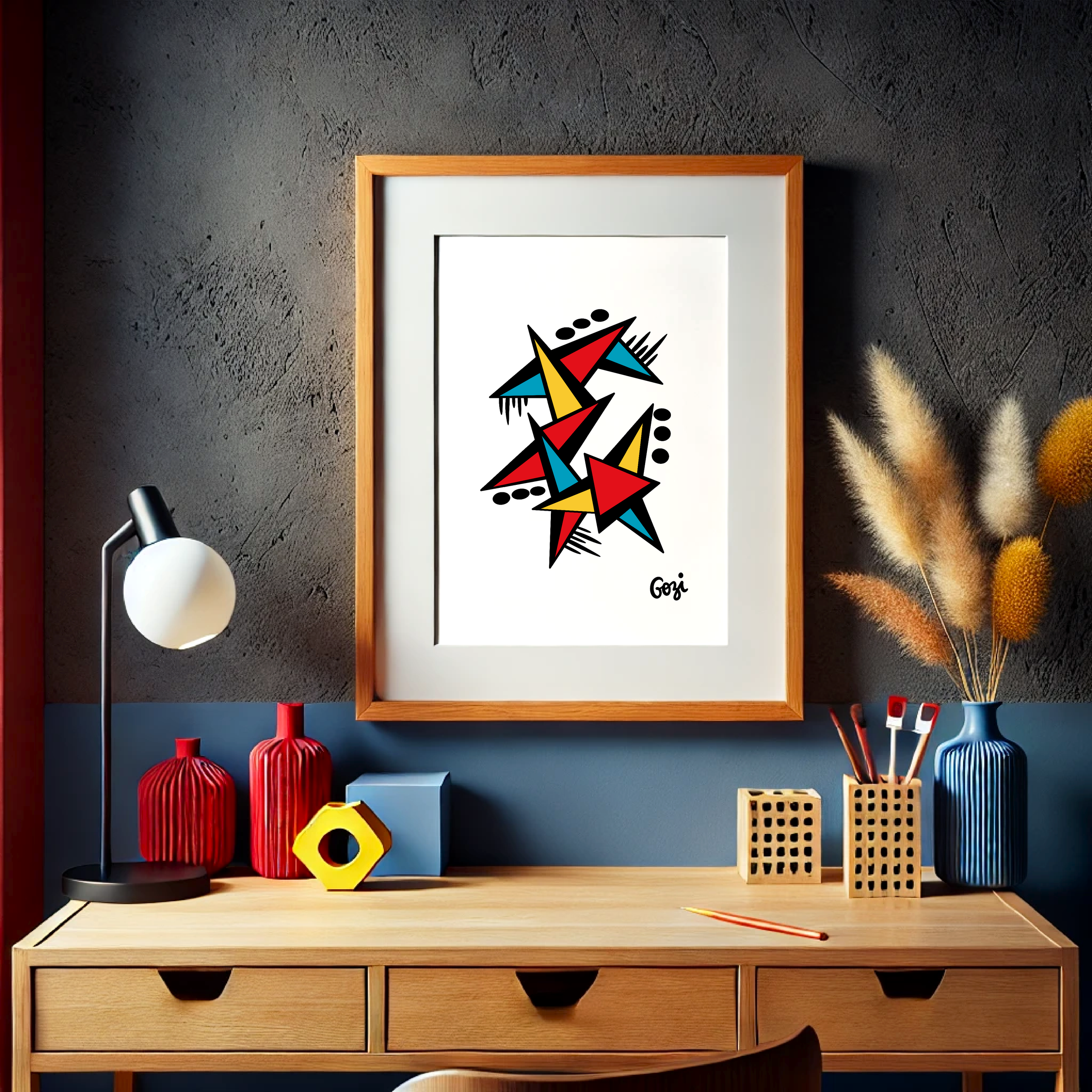 Image 3 of 5
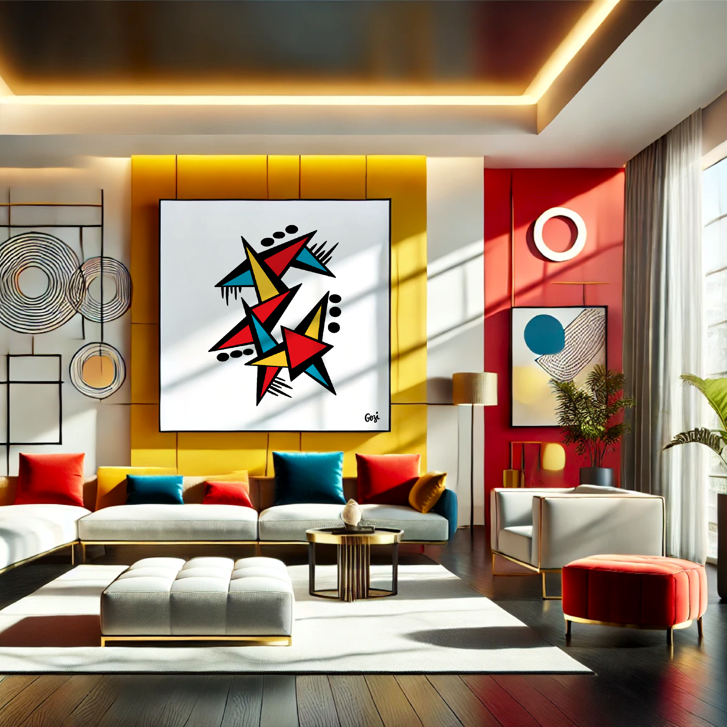 Image 4 of 5
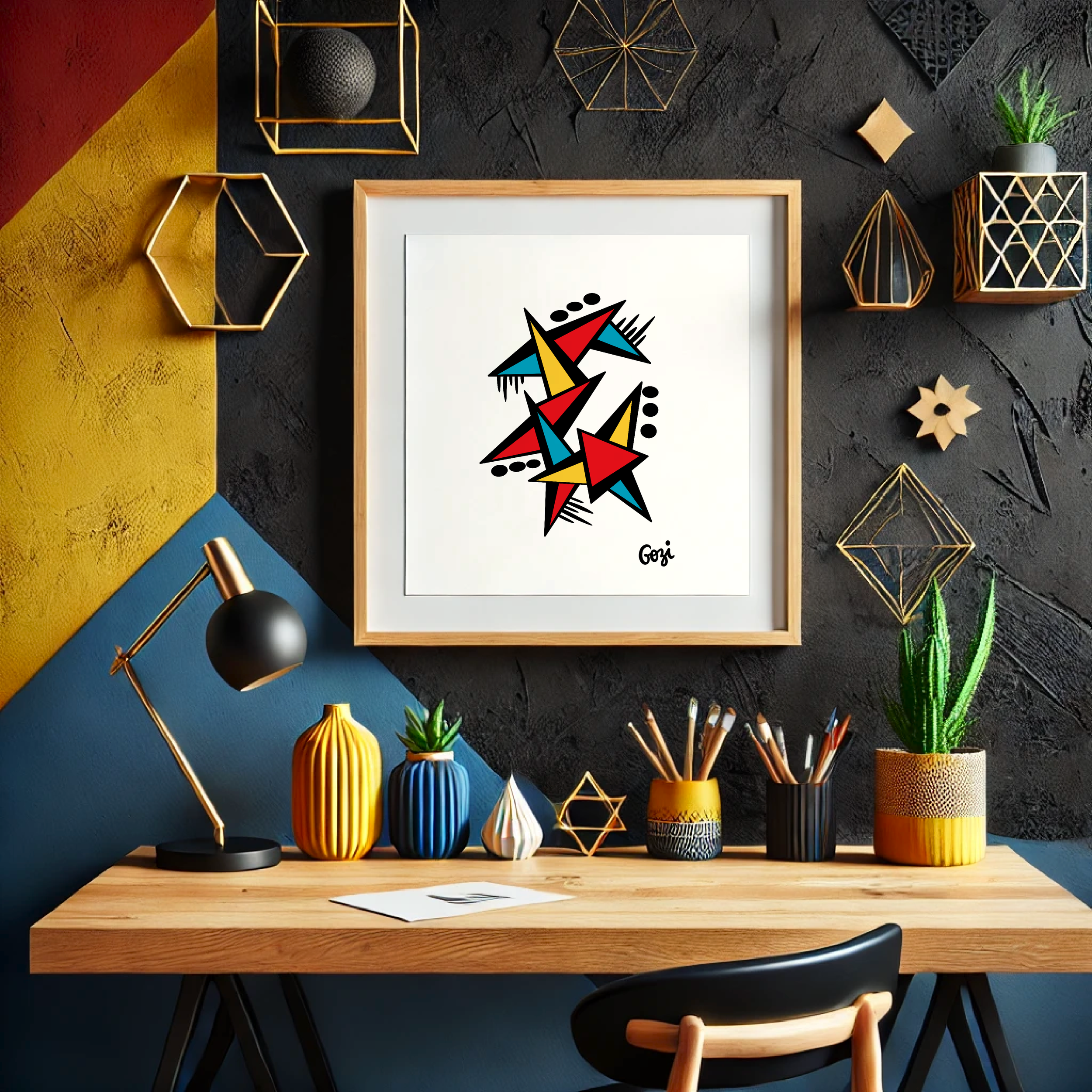 Image 5 of 5
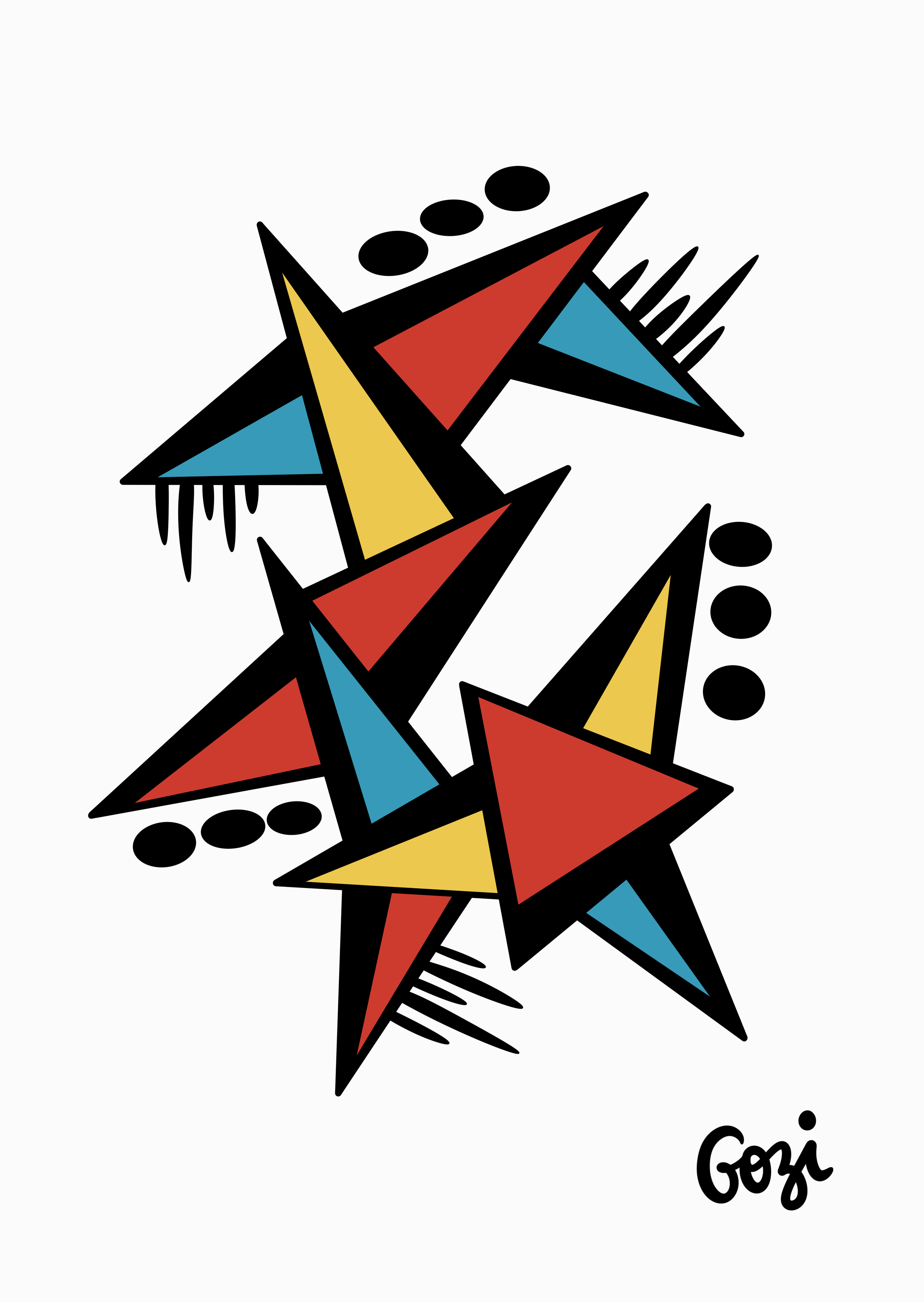
A particularly sharp-edged composition, this piece is for the discerning collector who finds curves a bit too emotionally needy. Gozi has captured the exact moment when several primary-coloured triangles decided to stage a mid-air collision, leaving the viewer to decide if it’s a masterpiece or a very stylish accident.
The Spiky Core: A dense intersection of red, yellow, and cyan triangles that appear to be fighting for dominance. It’s an ideal choice for anyone who wants their wall art to look like it could, if provoked, defend itself.
The "Wait, There’s More" Details: Little black fringes and floating ovals have been added throughout, presumably because the triangles looked a bit lonely. They provide a lovely sense of "purposeful clutter."
The Colour Authority: It uses the three primary colours with such conviction that you’ll feel slightly guilty for ever having preferred a pastel.
"It is a triumph of 'Pointillism'—in the sense that everything has a very sharp point. This is for the individual who wants their decor to scream 'I understand geometry' while secretly wondering which way is actually up. A must-have for the modern minimalist who thinks harmony is overrated."
Artist: Gozi (who signed it with a certain graphic flourish).
Vibe: Post-Modern Shrapnel.
Palette: Bold, unapologetic, and highly likely to clash with your floral curtains.
Function: Excellent for making guests feel like they’ve walked into a high-end design firm instead of your living room.
Ideally suited for staring at while pretending to understand a complicated jazz solo.