

 Image 1 of 3
 Image 2 of 3
 Image 3 of 3
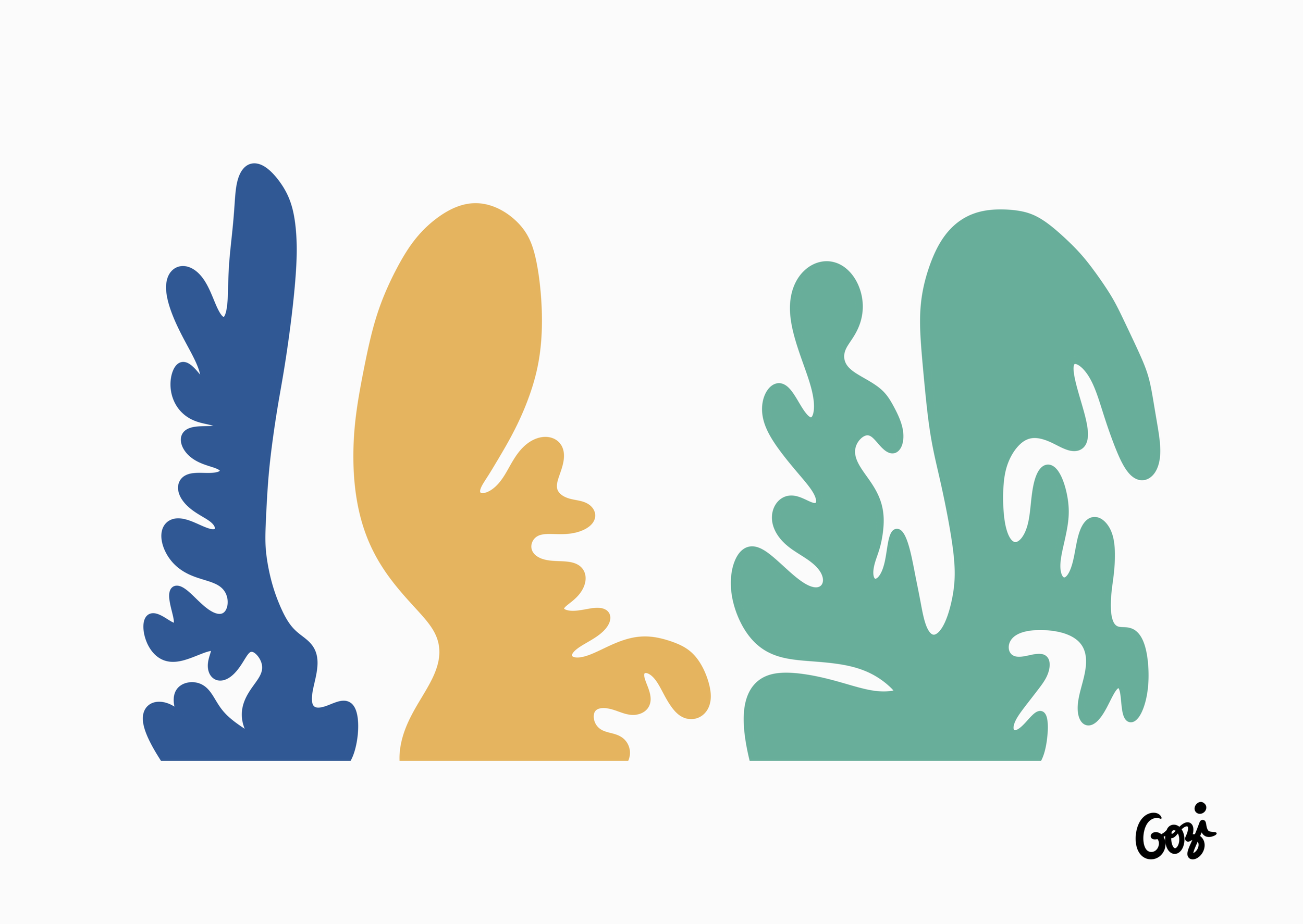
What one first notices about this triptych is its bold commitment to being "almost something." It’s like a conversation where everyone is waiting for someone else to make a point, but nobody does. The artist has achieved a state of masterful irrelevance.
The Verticality: It’s reassuringly upright. Like three quite polite, but entirely uncommunicative, people waiting for a bus. There's an admirable refusal to collapse into chaos.
The Shapes:
The Blue (Left): A valiant attempt at seaweed, or perhaps a particularly frustrated tree. One admires the effort to look organic, even if it feels a little staged.
The Ochre (Middle): A fascinatingly ambiguous form. Part squashed potato, part profile of someone attempting to hide their confusion. It’s the visual equivalent of clearing your throat.
The Teal (Right): A much larger shape that seems to have had a slightly more decisive moment of formation. Like a large, wet plant that’s decided to lean. It’s the quietest, but perhaps the most self-assured, of the three.
The Spacing: The gaps between them are commendable. It suggests a healthy level of mistrust between the elements. No one is getting too close to anyone else, which is very proper.
This piece is ideal for a wall that you want to fill, but without actually saying anything. It avoids any of that dreadful obviousness. It offers a perfect escape for anyone trapped in a social setting who needs a visual object to stare at intently while saying, "Ah, yes, the interplay of form..."
"It’s... perfectly serviceable. Does the job." — A surveyor assessing a potential property while ignoring the damp.
In summary, it’s a piece that sits on the wall with the serene confidence of someone who has absolutely nothing to do and is very good at it. Rather good, really.